UI Design / Experience Design

The Overview
Twitter is a global social networking platform where people share and discover information through short messages called tweets.
The Problem
At the time, Twitter was in the middle of a visual brand refresh, which meant its internal and external products needed to be updated to reflect the new identity. The challenge was not only to apply the new design language but also to ensure that usability and functionality improved along the way.
The Solution
Partnering closely with my Design Lead, I reimagined Twitter’s internal site, Birdhouse, aligning it with the refreshed brand guidelines while also enhancing the overall user experience. This involved translating the updated visual identity into scalable UI components and refining the interface to better support the needs of its internal users.
Twitter’s refreshed brand identity took an art-first approach, designed to capture emotion and expression at the core of the platform. Rather than building the system piece by piece around individual components, the design team embraced a creative system that was intentionally imperfect—raw, bold, and dynamic.
Some key principles of this new direction included:
Tears as a visual device to reveal information or highlight focus.
Layers and textures to reflect the constant flow of overlapping conversations.
Bold, vibrant colors to convey humor, intensity, and authenticity.
And, grounding it all, the iconic Twitter blue.

With this vision in mind, my Design Lead and I translated these principles into the redesign of Birdhouse, Twitter’s internal site. We infused the pages with the same sense of raw energy and layered emotion that defined the new brand—bringing consistency, personality, and usability into one cohesive experience.


Journey onto the next project
-
![]()
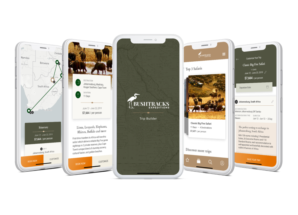
Bushtracks
-
![]()
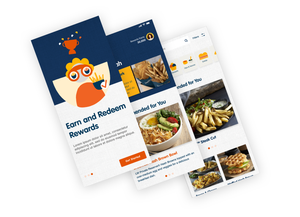
Lamb Weston
-
![]()
Mary Kay
-
![]()
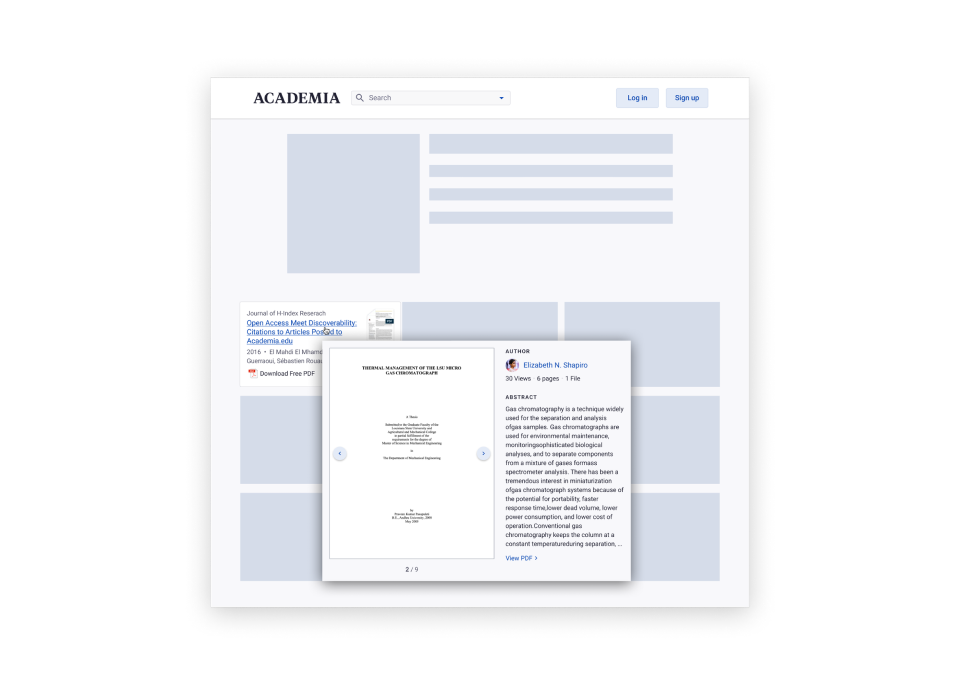
Academia Innovative Design
-
![]()
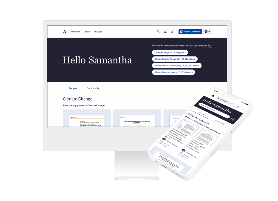
Academia Optimization Design
-
![]()
Academia Exploratory Design
-
![]()
Aya Optimization Design
-
![]()
Aya Exploratory Design
-
![]()
Aya Innovative Design