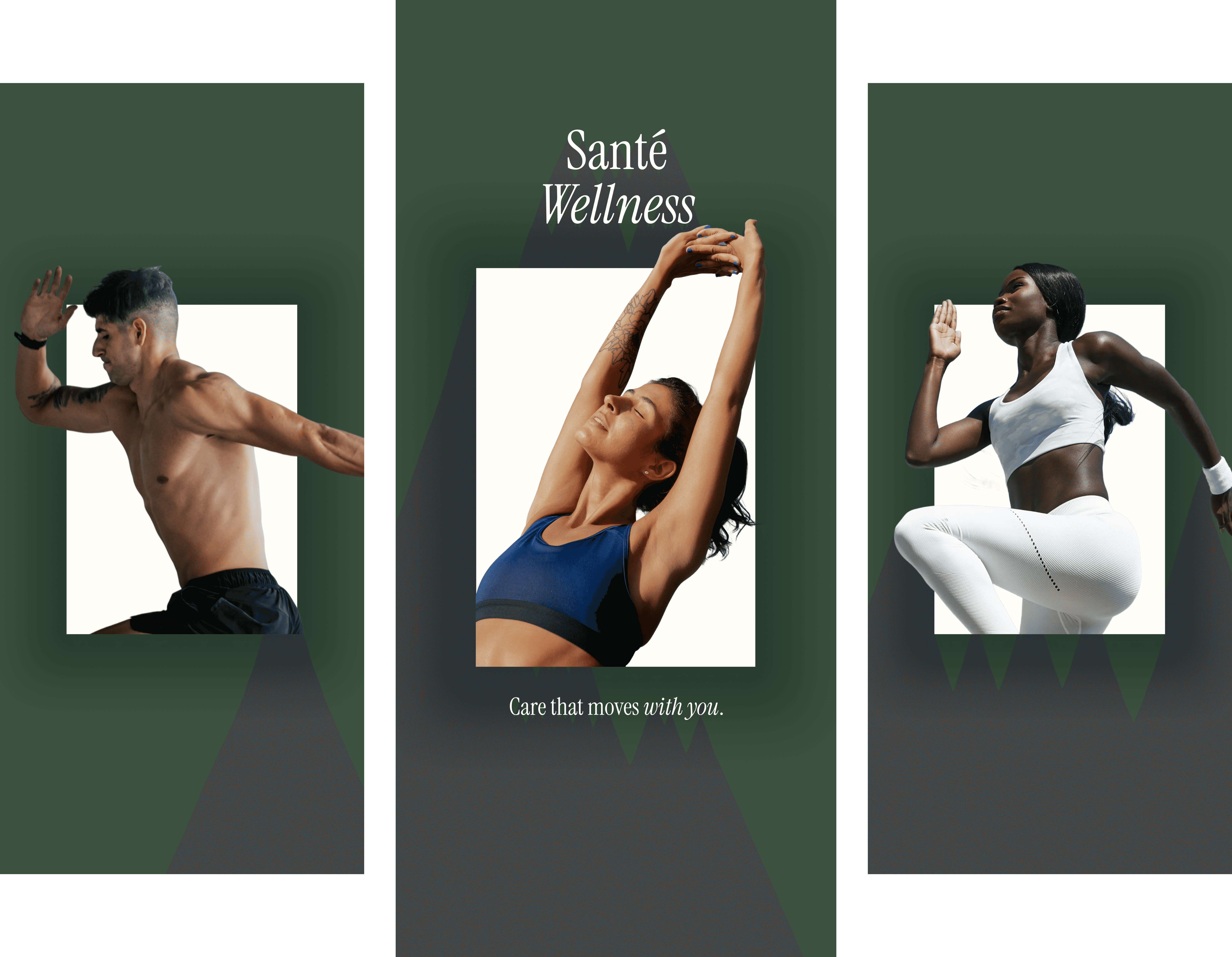
Santé Wellness

Most PT practices deliver exceptional care and a forgettable digital experience. Santé was designed to close that gap.

Client Project

Mobile App

Lead Product Designer

Web · iOS

April 2026 - Ongoing

A Practitioner's Vision for Better Care

Santé Wellness is the vision of Dr. Roger, a physical therapist who believes that exceptional care shouldn't stop when the session ends. He came to me with a concept: a client-facing app built around proactive health, evidence-based movement science, and a deeply personal provider relationship. My role was to take that vision and design the experience: a mobile platform that extends care beyond the appointment through home programs, progress tracking, provider messaging, and evidence-based education.

Problem

Physical therapy works. The evidence is strong, the outcomes are real, and for clients who engage fully - completing their home programs, maintaining contact with their provider between sessions, understanding why each exercise exists - the results are measurably better. The problem is that most PT practices make full engagement almost impossible. The tools are built for the provider, not the person receiving care.

Santé is a different kind of practice. It sits at the intersection of movement science and whole-person wellness - a concierge model with a philosophy centered on proactive health and longevity rather than reactive injury treatment. The clientele are active adults, professionals, and athletes who invest seriously in their health and expect their experiences to reflect that care.

The gap this project addresses: there is no client-facing digital product that matches the quality of the care itself. Clients book by text, receive PDF home programs, and have no structured way to track progress, communicate asynchronously with their provider, or engage with the educational content that makes Santé's approach to movement medicine distinct.

Design Premise

Design Premise

A client in a concierge PT practice expects more than a scheduling confirmation. They expect a product that treats their time, their progress, and their relationship with their provider with the same intentionality the practice brings to every session. Santé is that product - designed from the client's perspective outward, not from the practice management stack inward.

The Market Opportunity

Physical therapy and movement medicine occupy an unusual space in healthcare: outcomes are highly personal and embodied, the client-provider relationship is close and longitudinal, and the actual work happens largely off-screen - in a clinic, at home, or in motion. Yet the digital tools most PT practices rely on were designed for billing and scheduling, not for the therapeutic relationship itself.

Where Current Tools Fall Short

Where Current Tools Fall Short

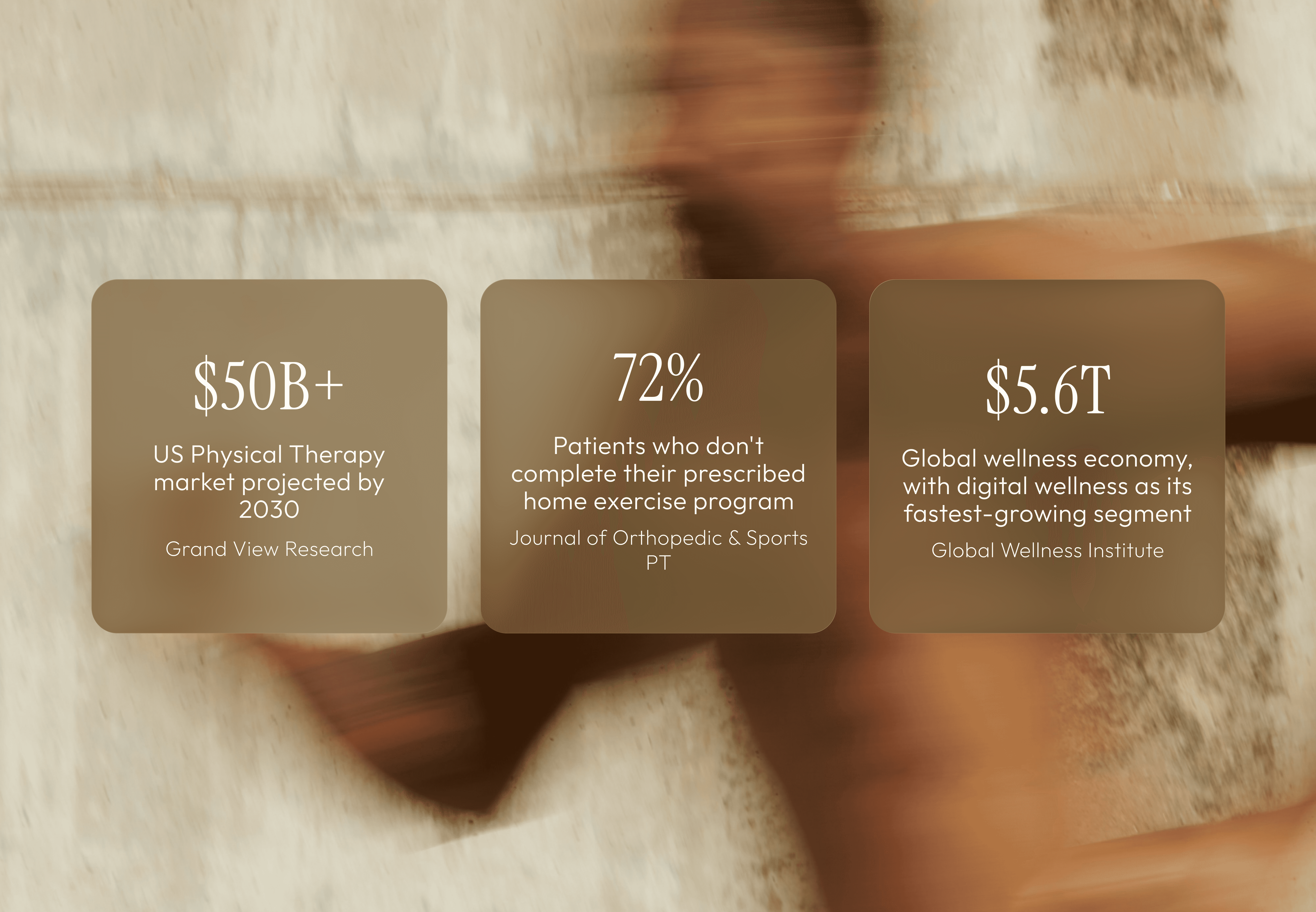
The dominant tools in the PT space - WebPT, Jane, Cliniko - are practice management platforms built for providers. The patient-facing surface is minimal: appointment confirmations, intake forms, maybe a PDF. There is no progress visibility, no content layer, no structured way for a client to stay engaged with their care between sessions.

Other parts of the wellness industry have moved in a different direction. Brands like Equinox and Eight Sleep have built experiences that feel personalized, progress-oriented, and designed with the user's goals at the center. But none of them operate in the evidence-based physical therapy space. There is a real gap between the clinical rigor of PT and the experience quality that health-conscious clients now expect from the tools they use.

Santé is designed to close that gap - to bring the same care and attention to the digital experience that the practice brings to every session.
Research & Discovery

My research process focused on two questions: what does a Santé client actually need between sessions, and what does the competitive landscape reveal about where the gaps are? I approached this by mapping the existing PT and wellness app ecosystem, seeing how a user can prioritize proactive health and use multiple tools to manage it, and looking closely at how brands outside healthcare have solved the problem of sustaining a personal, high-touch relationship through a digital product.

Who This Is For

Who This Is For

The Santé client is not someone who needs to be convinced to prioritize health - they already have. They are active adults, professionals, and athletes who approach wellness proactively and invest time and intention into their care. They expect personalization, they respond to evidence and expertise, and they are more likely to disengage from a tool that feels generic than to push through friction out of necessity. The bar for the product experience is set by the other well-designed tools in their life - not by the average healthcare app.

Competitive Landscape

Competitive Landscape

01

Practice management tools (WebPT, Jane, Cliniko)

Built for providers, not patients. The patient-facing surface is minimal - appointment confirmations, intake forms. No content, no progress visibility, no relationship layer between sessions.

02

Home exercise apps (PhysiTrack, HEP2go, Kaia Health)

More patient-forward, but clinical in aesthetics and tone. Designed for adherence tracking and documentation - not for an experience that feels as considered as the care itself.

03

Wellness brands (Equinox+, Eight Sleep, Whoop)

Set the right reference point for experience quality - personalized, progress-oriented, designed with the user at the center. But none operate in the evidence-based PT space. The gap between their UX and the PT category is the opportunity.

04

Telehealth platforms (Hims & Hers, Teladoc, Maven)

Have solved for async care delivery and in-app messaging. But they skew toward acute, transactional care. The longitudinal, relationship-driven PT model needs different UX patterns - continuity, not episode management.

Key Design Implications

Key Design Implications

The research pointed toward a clear product north star: Santé should feel like what would happen if a deeply considered wellness practice and a product team who actually understood movement medicine built something together. Not a clinical tool with a nice coat of paint - an experience genuinely built around the client's relationship with their care.

What clients need

What clients need

Visibility into their care plan and progress over time. A direct, asynchronous line to their provider. Access to educational content that reinforces their treatment. Frictionless booking across three session modalities. A sense of arc - where they started, where they are, where they're going.

What the product must avoid

What the product must avoid

Generic healthcare UI patterns that signal "medical portal." Notification-driven engagement mechanics that cheapen the brand. Complexity that requires the client to manage their own experience. Anything that creates friction between the client and the provider relationship that is the core of the service.

Design Principles

Before moving into screen design, I defined the principles that would govern every product decision. These aren't values statements - they're constraints I used to make hard calls about what to include, what to cut, and how to handle the tensions that come up when a carefully crafted care experience meets the practical demands of a digital product.

Competitive Landscape

Competitive Landscape

The relationship is the product

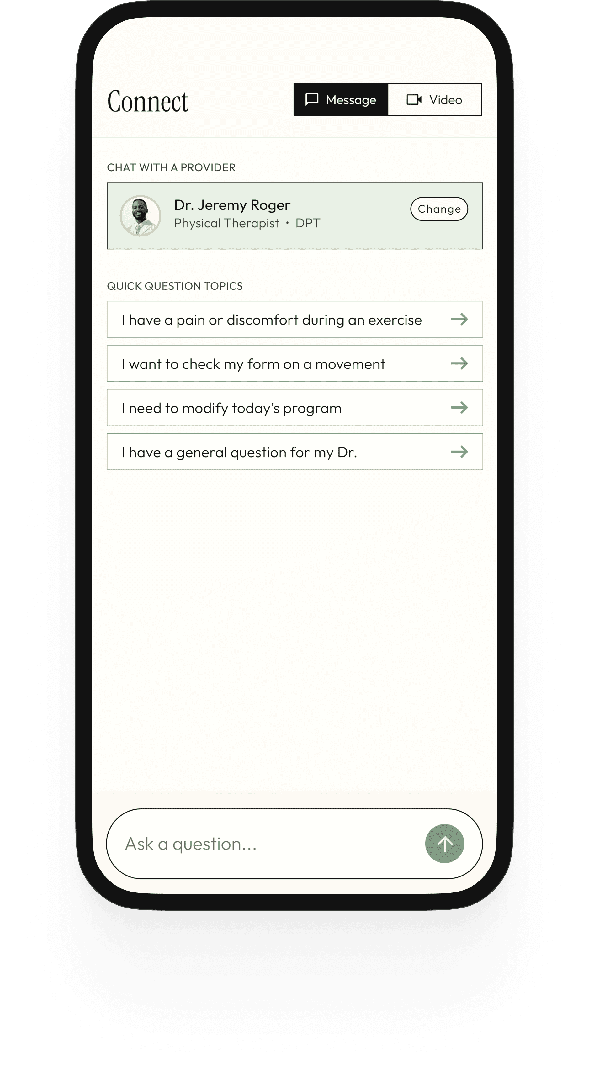
In physical therapy, the provider relationship is the therapeutic mechanism. Every feature in the app exists to extend that relationship between sessions - not to replace it or reduce it to a transaction. Messaging, care plan visibility, and progress tracking are all relational tools first.

Evidence, not noise

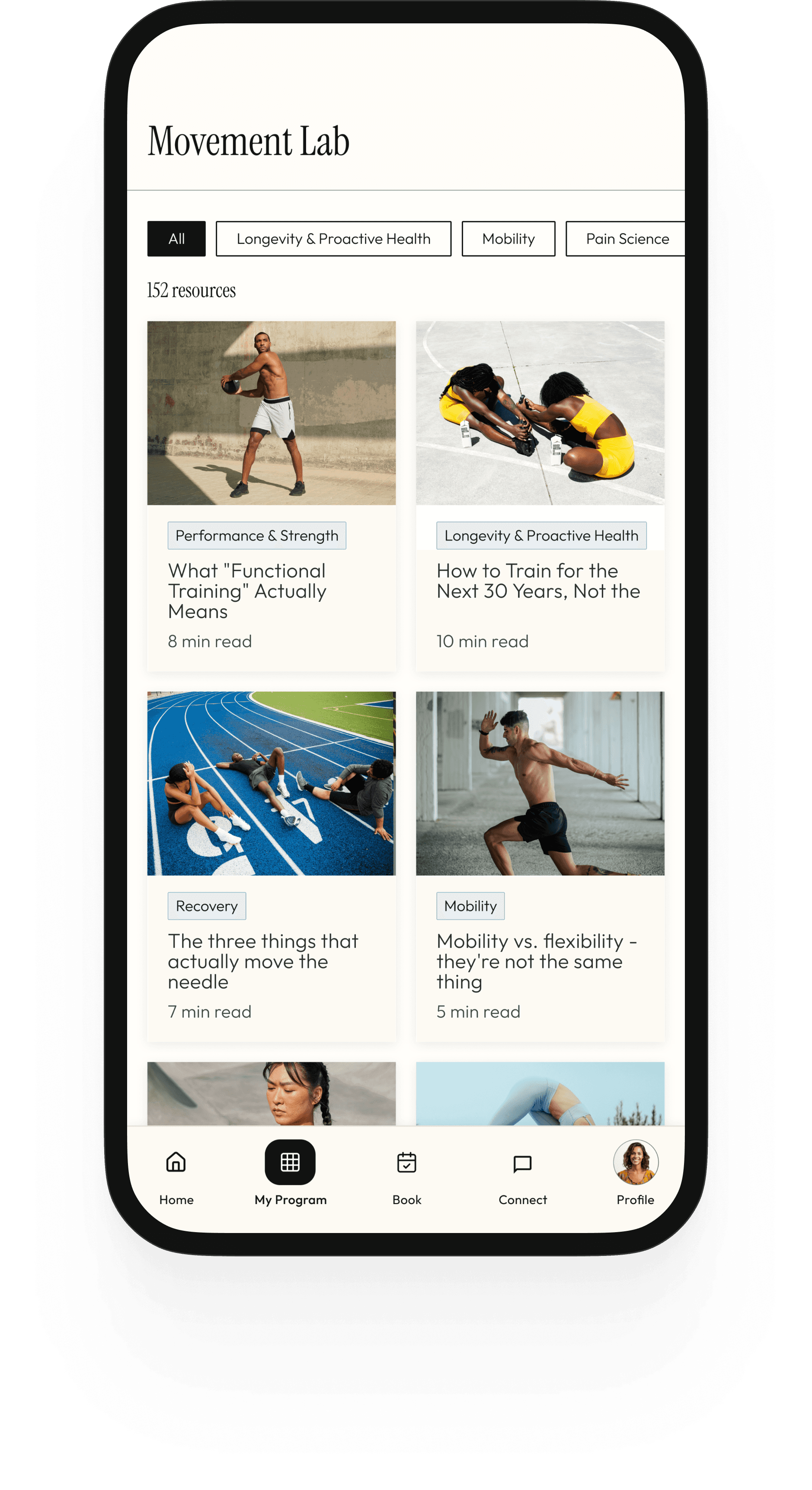
Santé's philosophy is movement science made accessible - educational, evidence-based, never fear-mongering. The content layer of the app must reflect this. The Movement Lab format belongs in the product, not just on social media. Content that doesn't serve the client's care or education doesn't belong here.

Restraint is a design decision

No gamification. No badge counts on every tab. No push notification strategy designed for engagement. A Santé client is investing in their health, not competing in a streak. The product earns trust through what it doesn't do - and through a visual and interaction quality that reflects the same care as the practice itself.

Design for the arc, not the moment

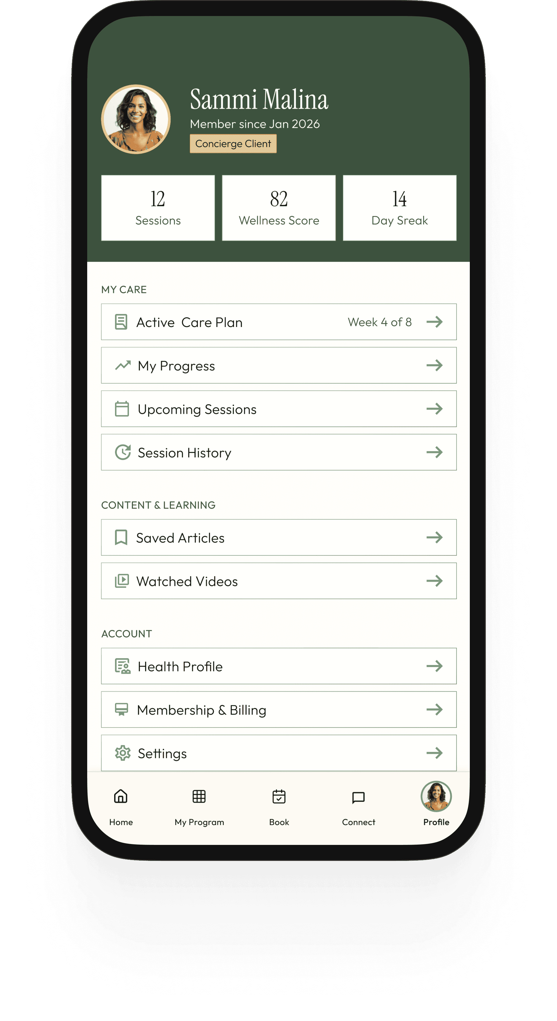
PT care is longitudinal - an 8-week plan, a progression of milestones, a journey from baseline to outcome. The product should make that arc visible at every touchpoint. A client should always know where they started, where they are now, and what's ahead.

The Hardest Tradeoff

The Hardest Tradeoff

The tension between visual warmth and clinical function showed up constantly. Healthcare UI typically trends toward neutral and accessible - because clarity and trust matter in health contexts. Experience-forward UI trends toward atmospheric and considered. I resolved this by being intentional about where each register lives: the dark forest headers and editorial type carry the brand's warmth and character; the care plan milestones and messaging threads carry precision and clinical clarity. The two registers coexist because they live in different parts of the screen - not because they're blended into a compromise that serves neither.

Product Strategy & Scope

Santé is a concept brand built around a clear and specific vision: a movement-centered wellness practice that blends evidence-based physical therapy, performance coaching, and recovery - delivered through a personal, concierge-style model that could eventually grow into a full clinic and digital platform. The product had to be designed with that vision in mind from the start.

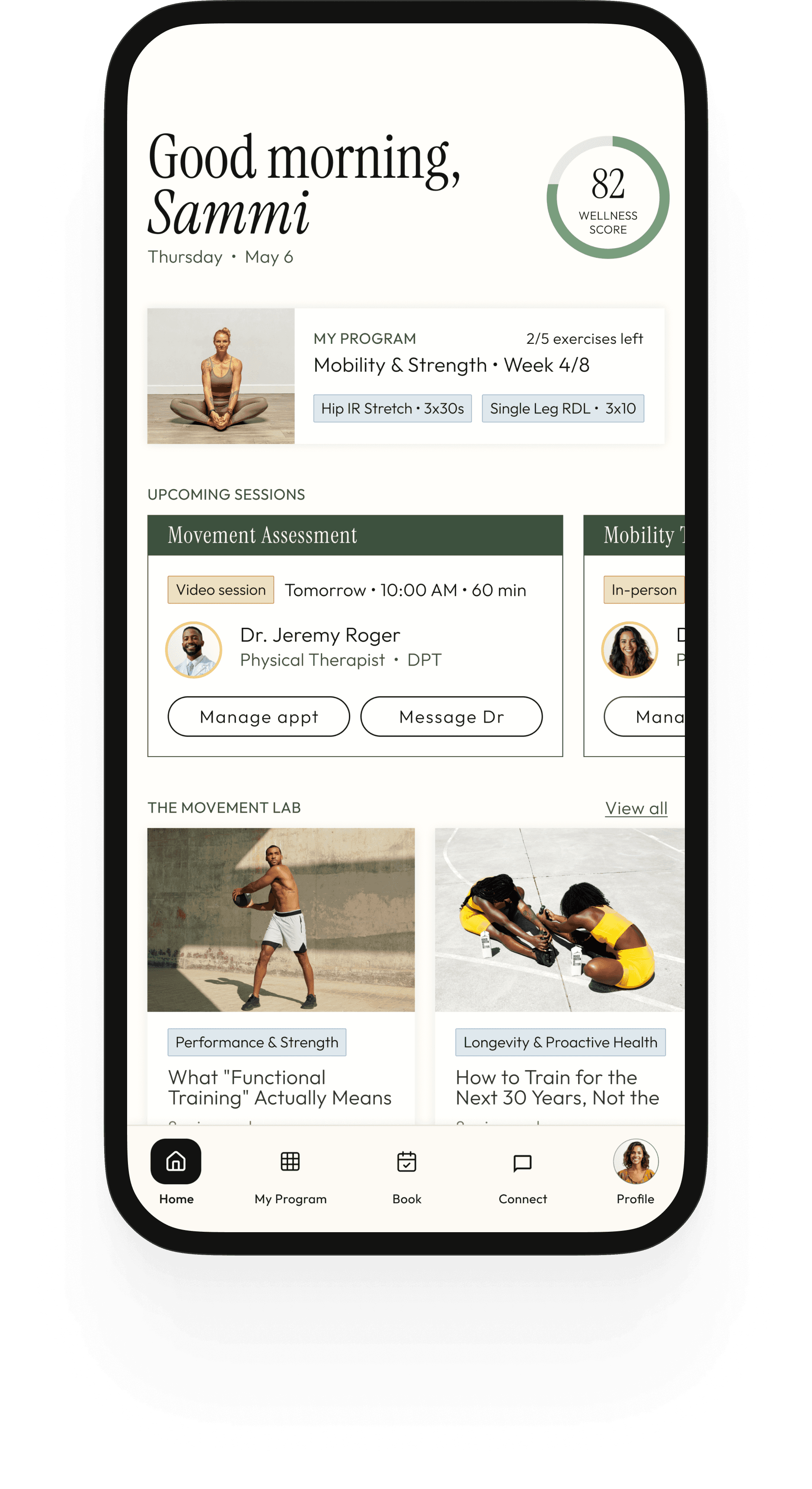
That created a real scoping challenge. A V1 app for a practice just launching looks very different from the full platform the vision points toward. Design too small and the product doesn't reflect the ambition of the brand. Design too large and you build something with no clear starting point. My framing: design the app as a vision-forward product - one that establishes the full experience arc while being honest about what would ship first versus what scales in. Features like the care plan tracker and wellness score are included as first-class citizens because they're central to what makes Santé distinct - not bolted on later as afterthoughts.
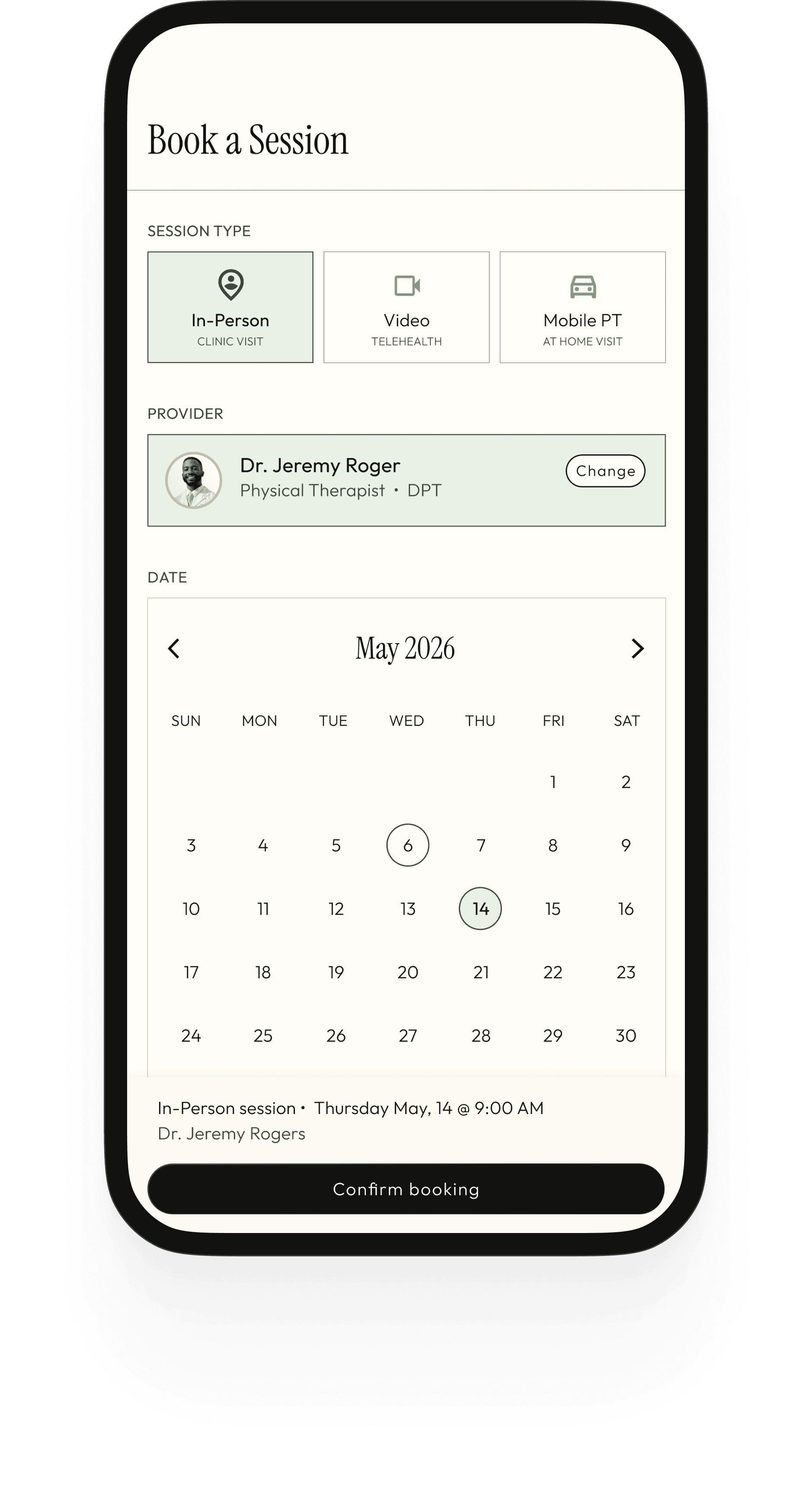
Scope Decisions

Scope Decisions

V1

Session Booking

V1

Central to the practice model. Three modalities: in-clinic, video, and mobile PT. Direct booking without friction.

V1

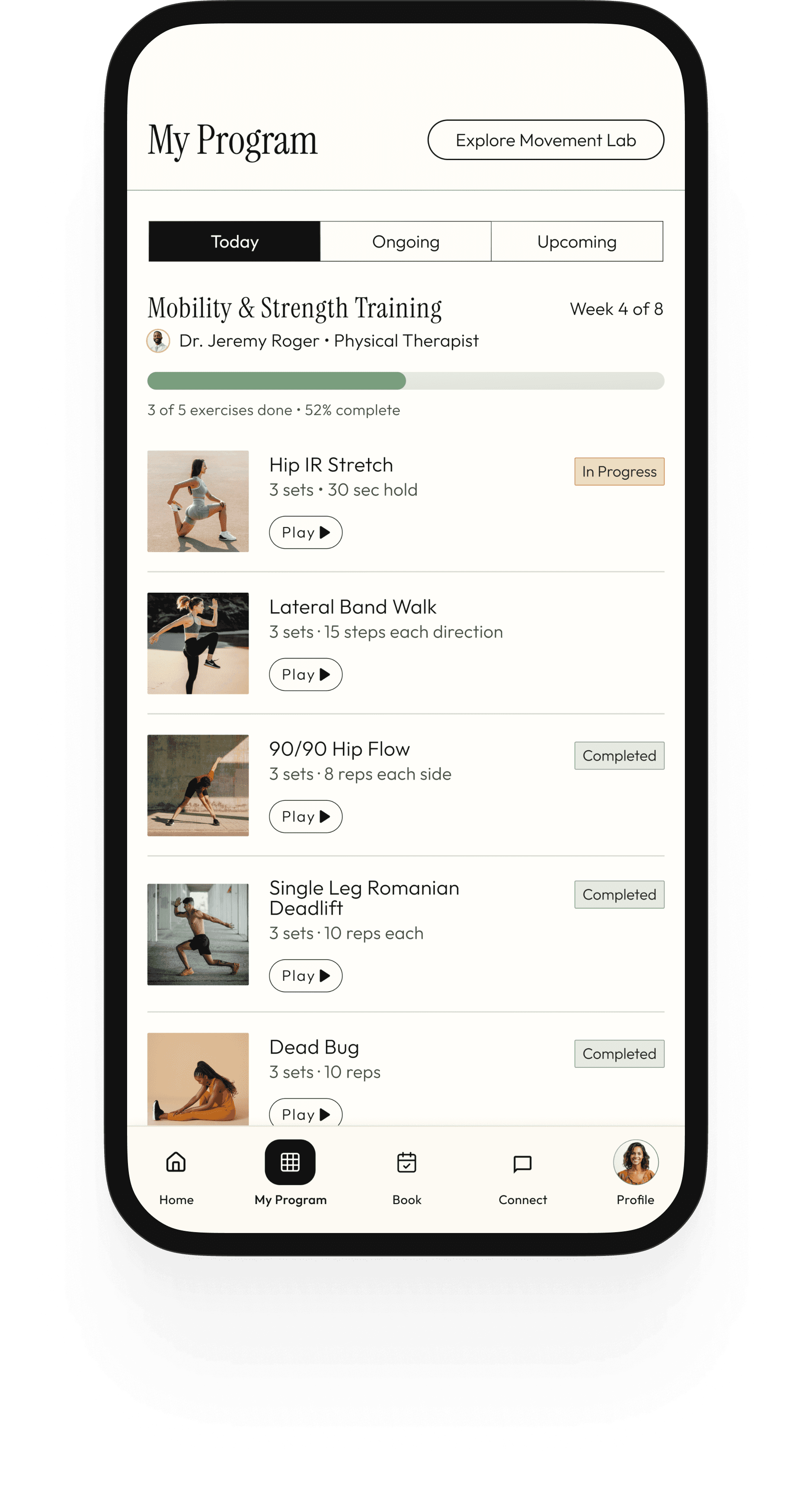
Home Program Builder

V1

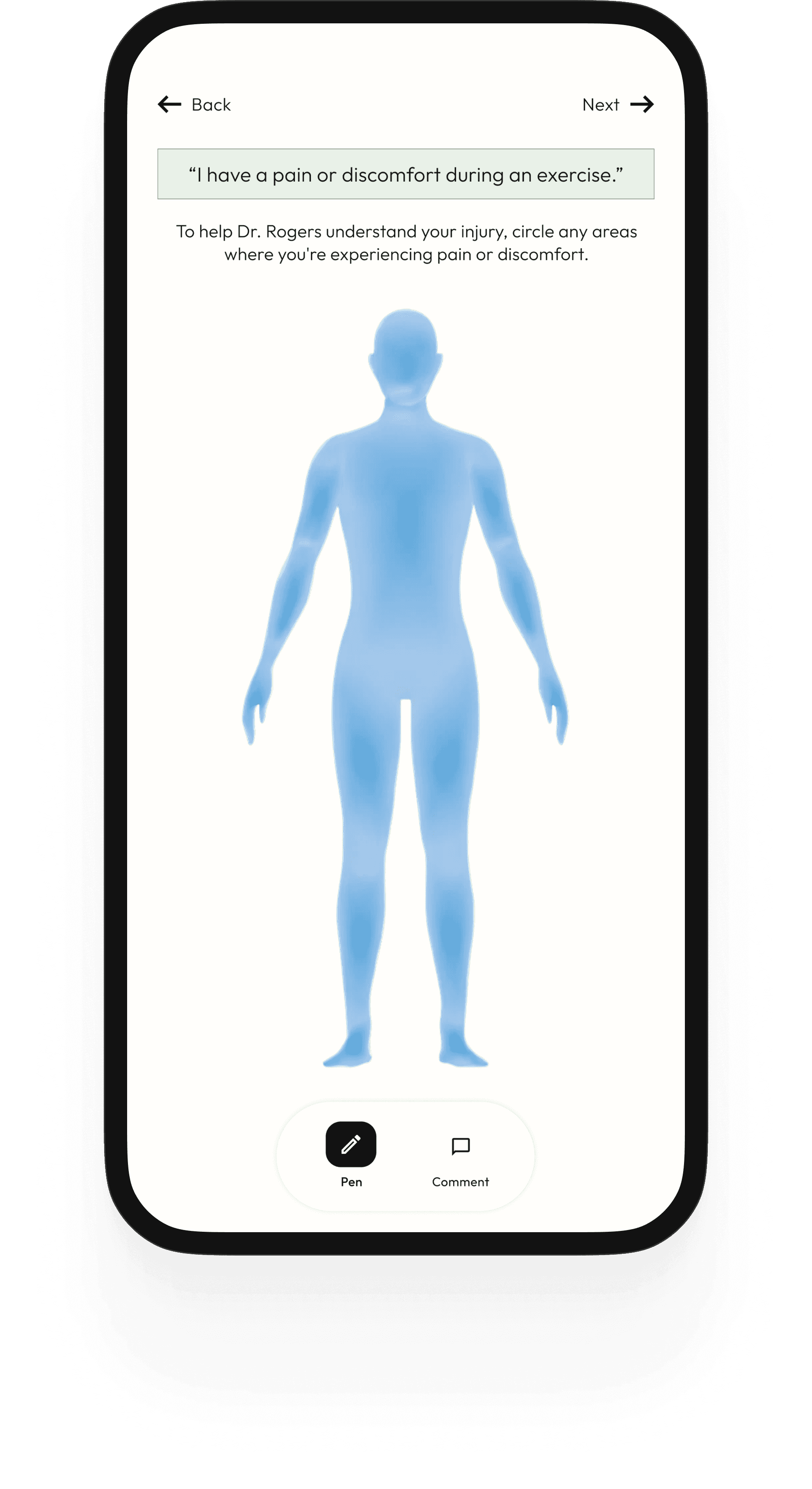
The provider-assigned exercise program needs to live in the app - not as a PDF attachment. Clients need to see their exercises, watch demos, log sets, and track completion against a care plan.

V1

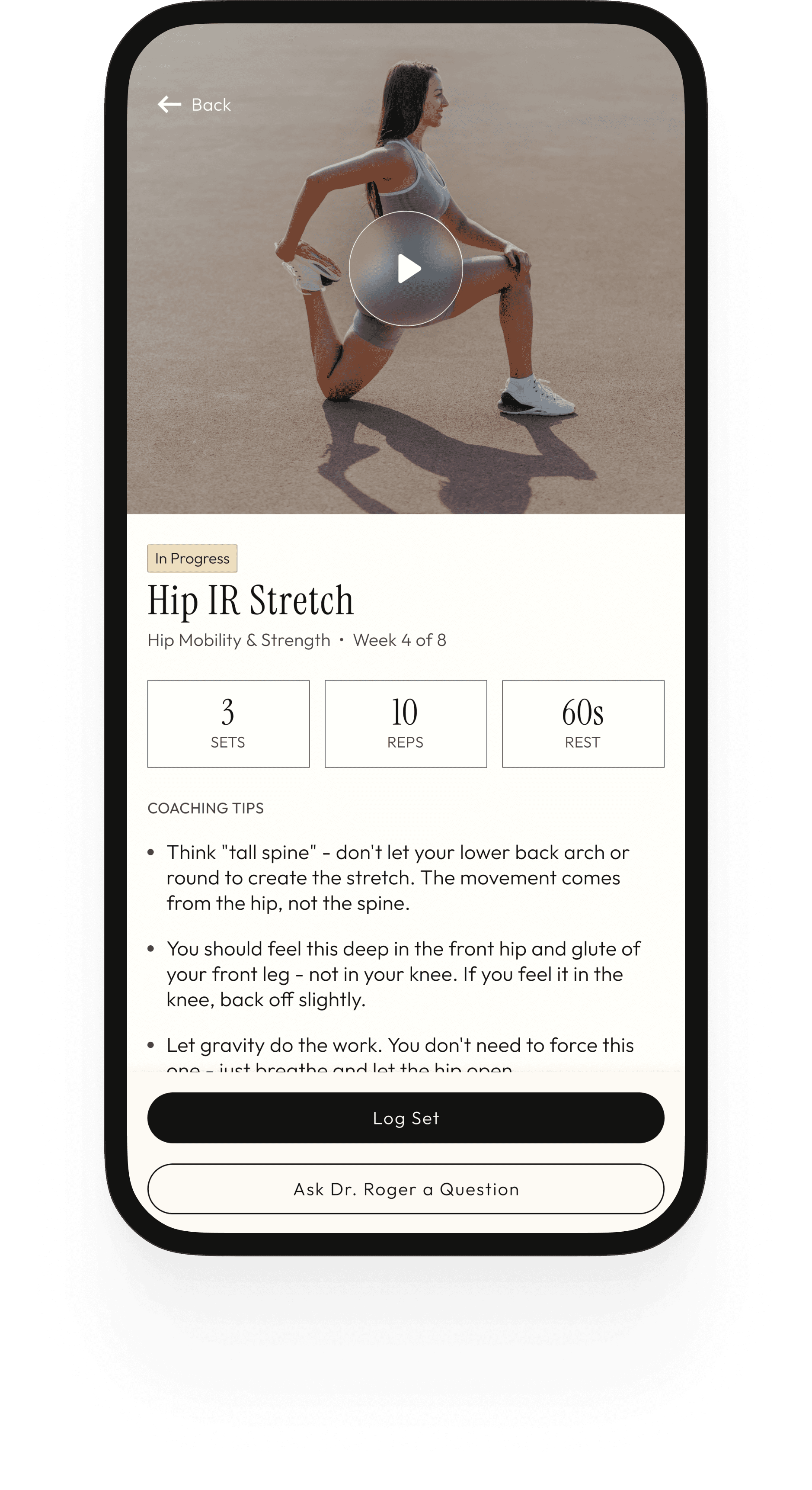
Exercise Video Library

V1

Video demonstrations with coaching cues are how clients learn correct movement patterns independently. This is core to safe home program execution and reduces the need for correction at sessions.

V1

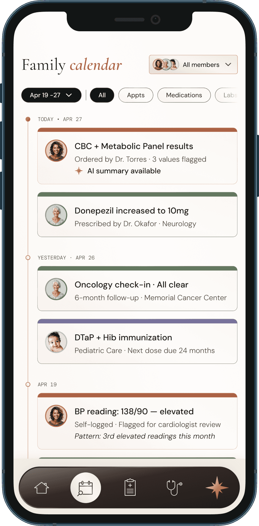
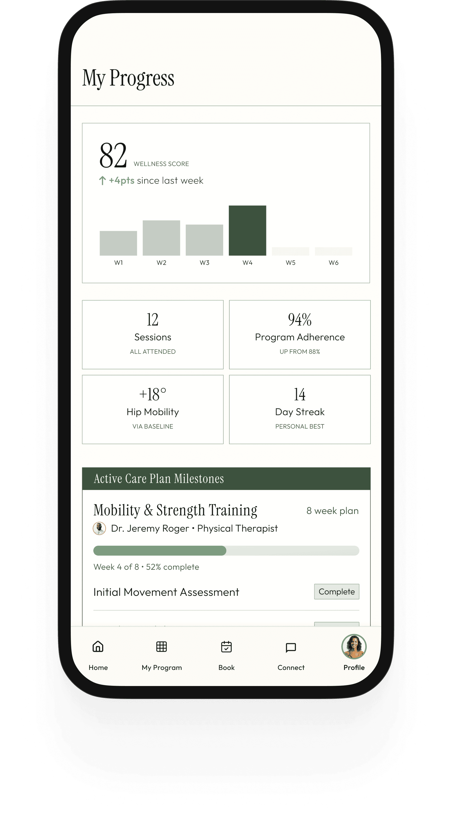
Progress & Data Tracking

V1

Adherence visibility, milestone progression, and metric tracking (mobility gains, session count, program completion) give clients a sense of arc across their care journey. High-leverage for engagement and outcomes.
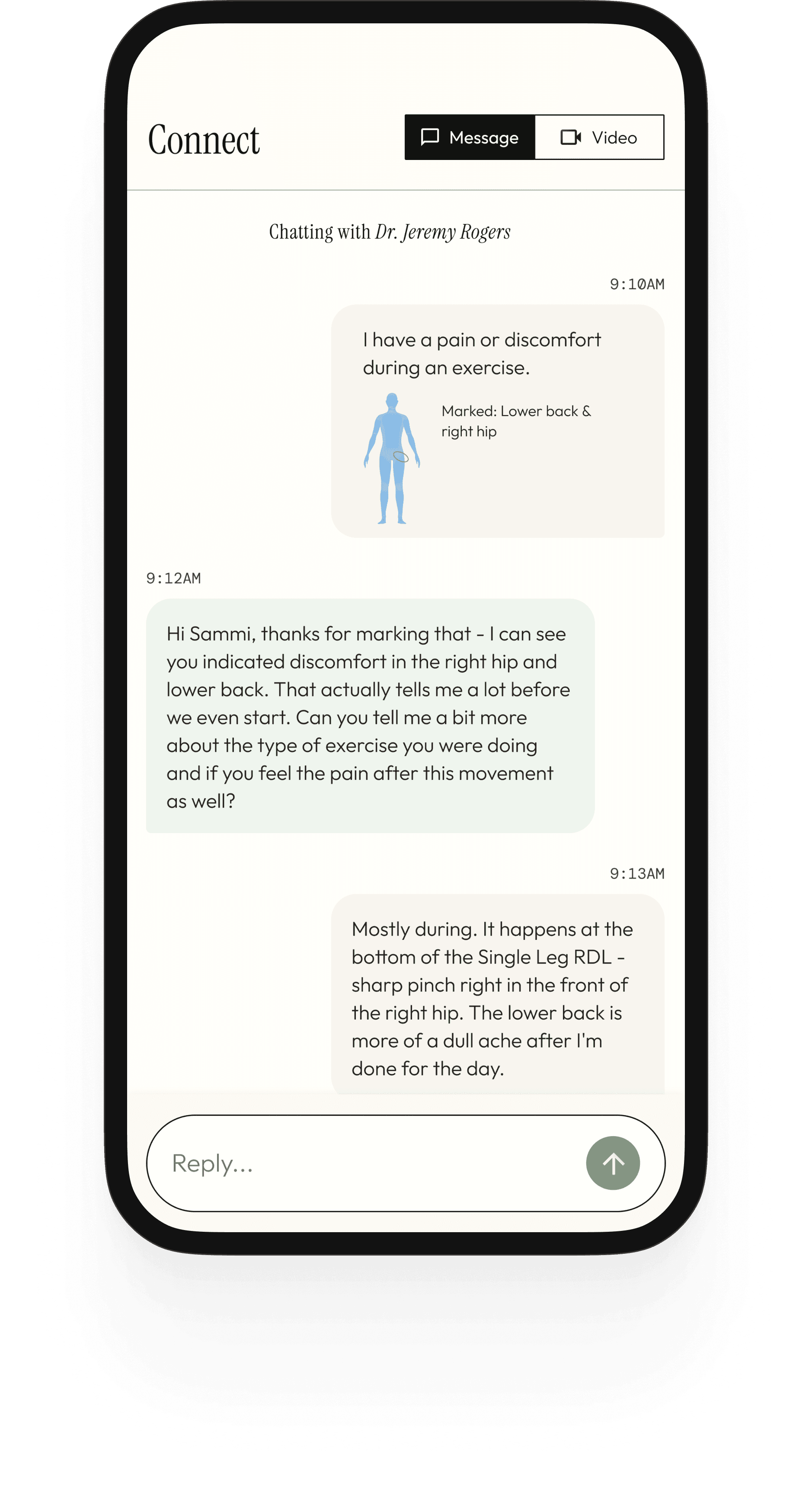
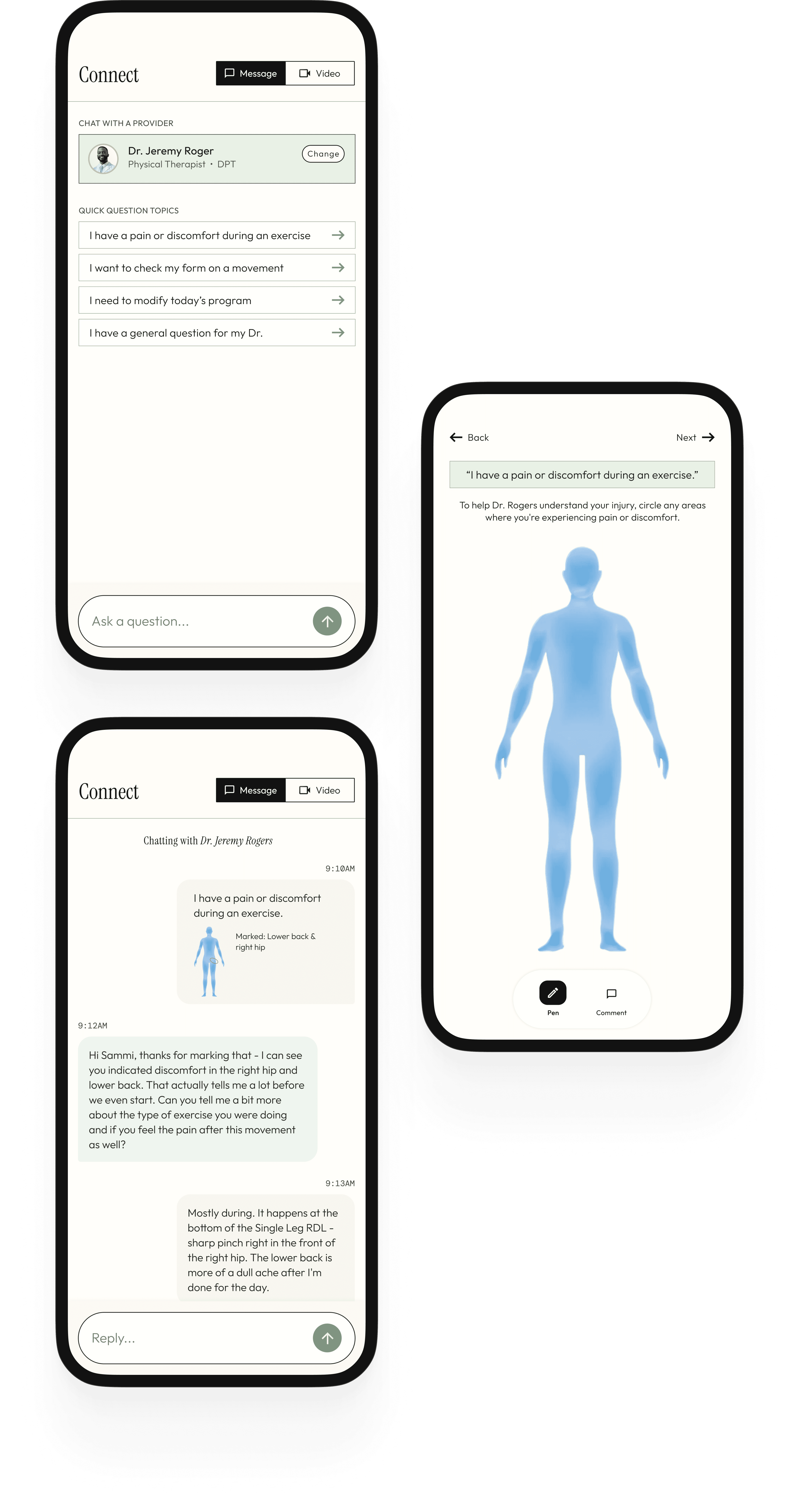
V1

Provider Messaging

V1

The PT relationship is longitudinal and personal. Async messaging with resource sharing (updated programs, articles) is a baseline expectation at this level of care.

V1

Telehealth / Check-in

V1

Quick video check-ins between sessions - for form questions, pain concerns, or program modifications - are a key part of the concierge care model. Structured in-app so it doesn't default to text.

V1

Education & Content Hub

V1

The Movement Lab series is central to the brand's identity and client experience. They belong in the product, not just on social media.

V2

Independent Platform / Memberships

V2

Long-term vision: users who aren't direct clients can access guided programs, educational content, and wellness tools independently. Requires subscription infrastructure and content at scale.

V2

Group Classes & Live Sessions

V2

Part of the broader ecosystem vision. Requires scheduling infrastructure and a different delivery model than one-on-one care.

Design

The Space Between Sessions

With the principles defined and scope set, I moved into screen design. Every decision was held against the same test: does this feel like a product that could only come from Santé, or does it feel like a wellness app template? The difference is in the details - type scale, color application, information density, and the moments where the practice's character shows through in UI patterns and microcopy.

Design

Proactive Visit Prep

Aura surfaces what matters before you even ask.

Santé Home

The home screen is designed to deliver three things in a single glance: where you are in your care (wellness score), what's next (upcoming session), and what you need to do today (program preview). The program preview on the home screen is a deliberate design decision - it surfaces the two most immediate exercises so clients see their daily action without having to navigate. The Research Round Up carousel sits below as content to discover, not content pushed at you.

My Program

The program screen is the heart of the day-to-day experience. It shows the full provider-assigned home program organized by phase and day, with a progress bar tracking weekly completion. Each exercise row has a play button (demo video), a completion checkbox, and the prescription (sets, reps, hold time). The phase header uses the dark forest treatment so clients always know which part of their plan they're in. This replaces the PDF entirely - the program lives in the app, updated by the provider between sessions.

Exercise Details

The exercise detail screen is where clients actually do the work. A video player at the top plays the demo (provider-recorded or curated). Below it: the prescription in three clear pills (sets, reps, rest), provider-written coaching cues, a log set button, and - critically - an "ask Dr. Rhodes a question" button that routes directly into the Connect tab. This last element is a direct response to the brief: the app should function as an extension of the concierge experience, not a static PDF replacement. If a client has a question mid-exercise, the answer is one tap away.

My Progress

The exercise detail screen is where clients actually do the work. A video player at the top plays the demo (provider-recorded or curated). Below it: the prescription in three clear pills (sets, reps, rest), provider-written coaching cues, a log set button, and - critically - an "ask Dr. Rhodes a question" button that routes directly into the Connect tab. This last element is a direct response to the brief: the app should function as an extension of the concierge experience, not a static PDF replacement. If a client has a question mid-exercise, the answer is one tap away.

Book a Session

The booking flow is designed around one constraint: it should take under 60 seconds from open to confirmed. Santé offers 3 session types: in-person, video and mobile PT - each presented as a simple 2×2 grid with a name and one-line descriptor. No insurance fields, no eligibility checks, no portal friction. The calendar surfaces availability with subtle dots rather than blocking out unavailable days - a small decision that keeps the interaction feeling open rather than restrictive. Provider selection, date, time, and a confirmation summary footer complete the flow. Every step has one job and moves the client forward.

Profile

The profile screen is the client's full picture in one place - not just account settings, but a living record of their care journey. Membership tier, session count, current streak, and wellness score sit at the top as a snapshot of engagement. Below it, the navigation splits deliberately into three categories: My Care (active care plan, progress data, session history), Content & Learning (saved articles, watched videos), and Account (health profile, billing, settings). This separation matters - it reinforces that Santé is not just a scheduling tool or a content platform, but both simultaneously, and the profile is where those two halves of the experience meet.

Movement Lab

The Movement Lab is where the educational side of Santé lives - articles, movement breakdowns, research explainers, and video resources organized by topic. Filter chips across the top (Longevity & Proactive Health, Mobility, Pain Science, Performance & Strength, Recovery) let clients find what's relevant to their current program without having to scroll through everything. The content isn't generic wellness filler - it's written to reflect the same evidence-based, plain-spoken voice that defines the practice. A client reading about why their hamstrings feel tight should come away understanding the difference between flexibility and mobility, not just feeling good about stretching more. The Movement Lab earns trust by being genuinely useful.

Connect With Your Provider

The Connect screen consolidates the entire communication layer of the practice into one place: video check-ins, async messaging, and structured quick-question prompts. The telehealth card at the top surfaces the provider's availability and offers both a scheduled and on-demand option. The quick question prompts are a key UX decision - rather than an open text field that can feel unclear (what do I write? how urgent?), they give clients structured entry points for the most common between-session needs. This reduces the cognitive barrier to reaching out, which improves both the care relationship and clinical outcomes.

Santé Home

The home screen is designed to deliver three things in a single glance: where you are in your care (wellness score), what's next (upcoming session), and what you need to do today (program preview). The program preview on the home screen is a deliberate design decision - it surfaces the most immediate exercises so clients see their daily action without having to navigate. The Movement Lab carousel sits below as content to discover, not content pushed at you.

My Program

The program screen is the heart of the day-to-day experience. It shows the full provider-assigned home program organized by phase and day, with a progress bar tracking weekly completion. Each exercise row has a play button (demo video), and the prescription (sets, reps, hold time). This replaces the PDF entirely - the program lives in the app, updated by the provider between sessions.

Exercise Details

The exercise detail screen is where clients actually do the work. A video player at the top plays the demo (provider-recorded or curated). Below it: the prescription in three clear pills (sets, reps, rest), provider-written coaching cues, a log set button, and an "ask Dr. a question" button that routes directly into the Connect tab. This last element is a direct response to the brief: the app should function as an extension of the concierge experience, not a static PDF replacement. If a client has a question mid-exercise, the answer is one tap away.

The exercise detail screen is where clients actually do the work. A video player at the top plays the demo (provider-recorded or curated). Below it: the prescription in three clear pills (sets, reps, rest), provider-written coaching cues, a log set button, and — critically — an "ask Dr. Rhodes a question" button that routes directly into the Connect tab. This last element is a direct response to the brief: the app should function as an extension of the concierge experience, not a static PDF replacement. If a client has a question mid-exercise, the answer is one tap away.

Movement Lab

The Movement Lab is where the educational side of Santé lives - articles, movement breakdowns, research explainers, and video resources organized by topic. Filter chips across the top (Longevity & Proactive Health, Mobility, Pain Science, Performance & Strength, Recovery, etc.) let clients find what's relevant to their current program without having to scroll through everything. The content isn't generic wellness filler - it's written to reflect the same evidence-based, plain-spoken voice that defines the practice. A client reading about why their hamstrings feel tight should come away understanding the difference between flexibility and mobility, not just feeling good about stretching more. The Movement Lab earns trust by being genuinely useful.

The exercise detail screen is where clients actually do the work. A video player at the top plays the demo (provider-recorded or curated). Below it: the prescription in three clear pills (sets, reps, rest), provider-written coaching cues, a log set button, and — critically — an "ask Dr. Rhodes a question" button that routes directly into the Connect tab. This last element is a direct response to the brief: the app should function as an extension of the concierge experience, not a static PDF replacement. If a client has a question mid-exercise, the answer is one tap away.

Connect With Your Provider

The Connect screen consolidates the entire communication layer of the practice into one place: video check-ins, async messaging, and structured quick-question prompts. The quick question prompts are a key UX decision - rather than an open text field that can feel unclear (what do I write? how urgent?), they give clients structured entry points for the most common between-session needs. This reduces the cognitive barrier to reaching out, which improves both the care relationship and clinical outcomes.

The exercise detail screen is where clients actually do the work. A video player at the top plays the demo (provider-recorded or curated). Below it: the prescription in three clear pills (sets, reps, rest), provider-written coaching cues, a log set button, and — critically — an "ask Dr. Rhodes a question" button that routes directly into the Connect tab. This last element is a direct response to the brief: the app should function as an extension of the concierge experience, not a static PDF replacement. If a client has a question mid-exercise, the answer is one tap away.

Book a Session

The booking flow is designed around one constraint: it should take under 60 seconds from open to confirmed. Santé offers 3 session types: in-person, video and mobile PT - each presented as a simple card with a name and one-line descriptor. Provider selection, date, time, and a confirmation summary footer complete the flow. Every step has one job and moves the client forward.

The exercise detail screen is where clients actually do the work. A video player at the top plays the demo (provider-recorded or curated). Below it: the prescription in three clear pills (sets, reps, rest), provider-written coaching cues, a log set button, and — critically — an "ask Dr. Rhodes a question" button that routes directly into the Connect tab. This last element is a direct response to the brief: the app should function as an extension of the concierge experience, not a static PDF replacement. If a client has a question mid-exercise, the answer is one tap away.

My Progress

The progress screen makes the care arc visible in a way a session alone cannot. The wellness score is shown as a bar chart trend across weeks - a trend indicator, not a grade. Below it, four metric cards show the data that matters most: sessions attended, program adherence rate, mobility gains vs. baseline, and current streak. The care plan milestone tracker at the bottom gives clients the clearest picture of where they are in the plan.

The exercise detail screen is where clients actually do the work. A video player at the top plays the demo (provider-recorded or curated). Below it: the prescription in three clear pills (sets, reps, rest), provider-written coaching cues, a log set button, and — critically — an "ask Dr. Rhodes a question" button that routes directly into the Connect tab. This last element is a direct response to the brief: the app should function as an extension of the concierge experience, not a static PDF replacement. If a client has a question mid-exercise, the answer is one tap away.

Profile

The profile screen is the client's full picture in one place - not just account settings, but a living record of their care journey. Membership tier, session count, current streak, and wellness score sit at the top as a snapshot of engagement. Below it, the navigation splits deliberately into three categories: My Care (active care plan, progress data, session history), Content & Learning (saved articles, watched videos), and Account (health profile, billing, settings). This separation matters - it reinforces that Santé is not just a scheduling tool or a content platform, but both simultaneously, and the profile is where those two halves of the experience meet.

The exercise detail screen is where clients actually do the work. A video player at the top plays the demo (provider-recorded or curated). Below it: the prescription in three clear pills (sets, reps, rest), provider-written coaching cues, a log set button, and — critically — an "ask Dr. Rhodes a question" button that routes directly into the Connect tab. This last element is a direct response to the brief: the app should function as an extension of the concierge experience, not a static PDF replacement. If a client has a question mid-exercise, the answer is one tap away.

Outcomes & Validations

Outcomes & Validations

A Foundation Worth Building On

A Foundation Worth Building On

Because this is a concept project, I can't point to shipped metrics. What I can speak to is how the design decisions hold up against the core problem - and where real-world validation would be essential before building.

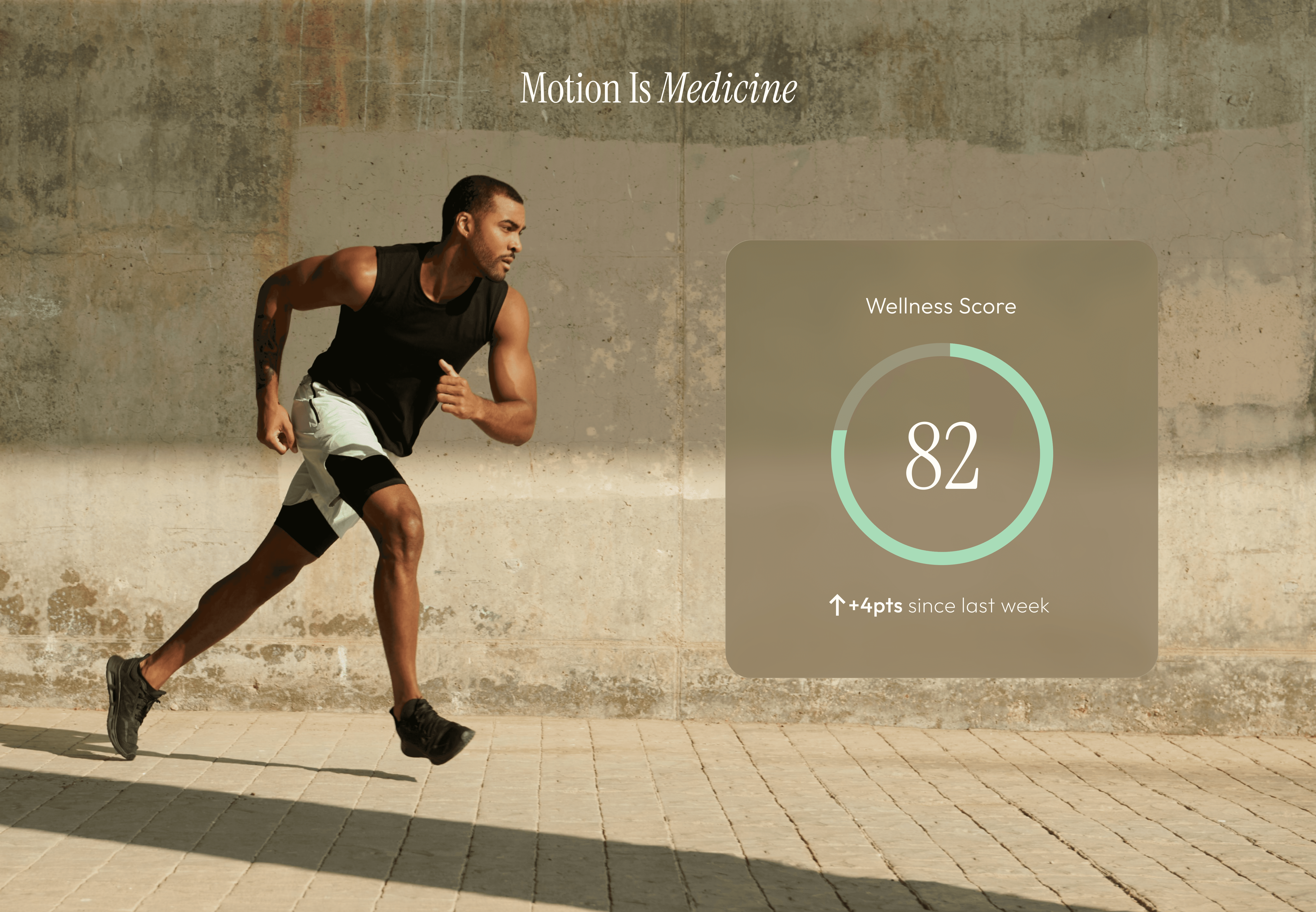
The wellness score is the design decision I'd want to test first. A numerical representation of overall health is a high-stakes UI pattern - it needs to feel motivating rather than anxiety-inducing, and the algorithm behind it needs to be transparent enough for a sophisticated client to trust. I'd want to validate both the concept and the presentation with real users before committing to it as a home screen anchor.

The dual-mode tension between the content platform (Explore) and the care tool (Home, Book, Messages) would also need user research to validate. The navigation architecture resolves this through clear separation, but whether clients experience the two modes as one coherent product or as two separate mental models is a question the design can't answer on its own.

Reflection

Reflection

What I Learned From This Project

What I Learned From This Project

This project allowed me to design for a user who is simultaneously a healthcare patient and someone who brings high expectations to the tools they use - and those two identities create genuine tension in almost every product decision. The learnings that came out of navigating that tension feel broadly applicable to any healthcare product that operates outside the insurance-driven, clinically-neutral default.

Ready to build something together?

Let's connect!

Ready to build something together?

Let's connect!

Ready to build something together?

Let's connect!

Ashley Carmen Uy • Lead Product Designer